
Introduction
There is something almost magical about a beautifully draped throw. One simple piece of fabric can completely change the energy of a room — making it feel warmer, more layered, more lived-in. If you have ever wondered why some living rooms look effortlessly styled while yours feels a little flat, the answer is often in the details. And throws? They are one of the easiest, most affordable details you can use.
Decorating with throws is genuinely one of the first things I recommend to anyone refreshing their home on a budget. You do not need to repaint walls or buy new furniture. A thoughtfully chosen throw, draped in the right way, can add color, texture, and personality to any space in minutes. Whether you are styling a sofa, layering a bed, or adding warmth to a reading chair, throws are one of those rare decor items that work in virtually every room and every style.
In this guide, you will find nine designer-approved tips that go way beyond just “toss it over the couch.” We are talking about texture layering, color theory, seasonal swaps, and all the little tricks that make a space look intentional and beautiful.
Key Takeaways
- Throws work best when they contrast slightly in color or texture with the surface beneath them
- Layering two or three throws together creates a richer, more designer-quality look
- The draping technique matters just as much as the throw itself
- Matching your throw to your season or color palette keeps your space feeling fresh year-round
- Throws are not just decorative — choosing the right material affects both look and function
- Even a budget throw can look luxurious when styled with intention
1. Choose Texture Over Color First
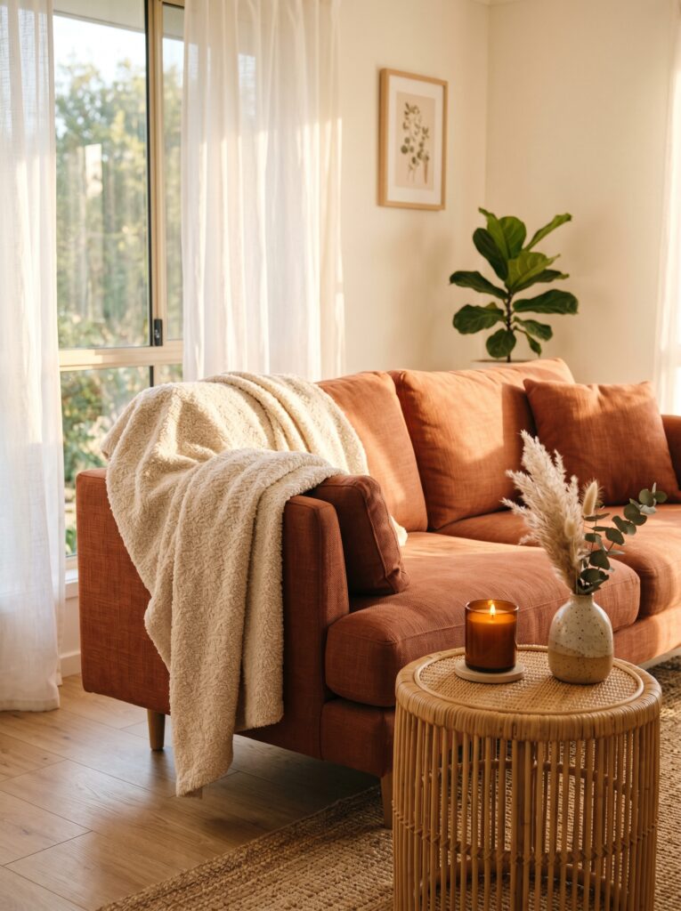
Most people grab a throw because the color appeals to them. That is completely understandable — but experienced decorators almost always think about texture first. Why? Because texture is what you feel in a room, even before you consciously register it. A chunky knit throw reads as cozy and casual. A faux fur drape feels glamorous. A waffle-weave cotton throw looks clean and modern.
Key Elements:
- Chunky knit throws for farmhouse, cottagecore, or rustic-style rooms
- Boucle and bouclé-blend throws for contemporary or warm minimalist spaces
- Faux fur throws for maximalist, glam, or Hollywood Regency interiors
- Woven cotton or waffle-weave throws for Scandinavian or coastal homes
- Velvet throws for moody, jewel-toned, or eclectic spaces
- Linen-cotton blend throws for airy, French country, or transitional interiors
- Fringe-edge throws for boho, global, or artisan-style rooms
How to Style It:
- Identify the dominant texture already in your room (smooth leather sofa, linen cushions, wooden floors).
- Choose a throw that contrasts slightly — a rough knit on a smooth leather sofa, for example.
- Avoid matching the throw texture too closely to your cushion covers.
- If your room already has a lot of pattern, choose a solid textured throw for balance.
- Lay the throw flat on a table before buying — run your hand across it to feel the weight and texture.
- Consider whether the texture looks good draped or only when folded.
- Test it in natural light before committing; some textures look flat under store lighting.
In my experience, a single boucle throw on a plain sofa does more styling work than three patterned cushions. Texture speaks louder than color in a calm, well-styled room.
2. Master the Art of the Casual Drape
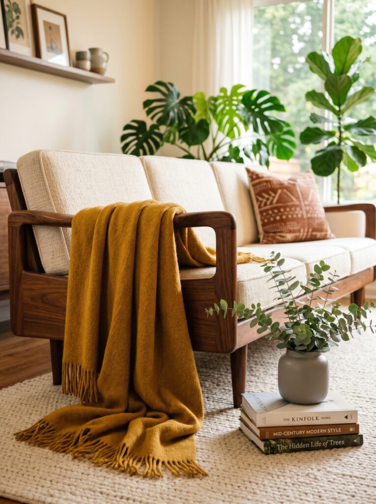
The way you drape a throw is arguably more important than the throw itself. A gorgeous cashmere blanket folded in a perfect rectangle looks stiff and sterile. The same throw tossed loosely over an armrest with one corner falling naturally to the floor? Suddenly it looks like a magazine spread.
Key Elements:
- A lightweight throw with enough drape to fall naturally
- Furniture with clean, defined edges (arm of sofa, foot of bed, back of chair)
- Enough length in the throw to create a soft pool or fold at the bottom
- A secondary accent nearby — a plant, a lamp, a side table — to complete the vignette
- Throw should measure at least 50″ x 60″ for comfortable single-drape coverage
- Neutral or muted palette works best for casual drapes
- Fringe or tassel edges add extra visual movement when draped
How to Style It:
- Start by not folding the throw at all. Shake it out loosely and let it fall naturally over the sofa arm or chair back.
- Gather the middle section loosely with one hand and drape it over the furniture surface.
- Let one end hang slightly lower than the other — this asymmetry looks intentional and styled.
- Arrange any fringe or tassel details so they hang freely and do not bunch up.
- Step back and look at the drape from across the room, not up close — adjust for the wide view.
- For a slightly more polished look, fold the top third loosely back on itself before draping.
- Avoid overly symmetrical placement — it reads as stiff and staged.
3. Layer Two Throws for a Richer Look
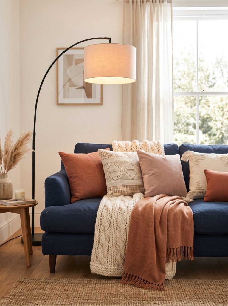
If one throw looks good, two throws look designer-level good. This is one of the simplest tricks used in interior photography and showroom styling: layering two throws of different weights and textures together creates depth, visual richness, and that elusive “collected over time” quality that makes a room feel personal rather than showroom-perfect.
Key Elements:
- Two throws with clearly different textures (one smooth, one chunky)
- Complementary or analogous colors — not matching, not clashing
- Different weights — one heavier, one lighter
- Contrasting edge details (fringe vs. clean edge)
- A sofa or bed large enough to accommodate both without looking overcrowded
- One throw should be neutral to anchor the pairing
- Second throw can introduce a pattern or accent color
How to Style It:
- Start with the larger or heavier throw as the base — drape it across the sofa arm first.
- Arrange the second, lighter throw on top, slightly offset to one side.
- Make sure both throws are visible — avoid covering one completely with the other.
- Let the colors relate without matching: rust and cream, sage and ivory, navy and caramel.
- If one throw has a pattern, keep the other solid to avoid visual competition.
- Tuck one end of the base throw slightly under a cushion for a naturally anchored look.
- Fluff the cushions around both throws to integrate the whole arrangement.
I’ve tried this trick countless times, and the layered two-throw approach almost always gets the most comments from guests. It looks expensive, but often costs less than one decorative cushion.
4. Match Your Throw to the Season
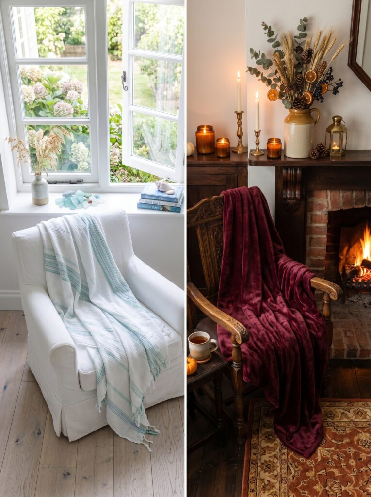
One of the most budget-friendly decorating habits you can develop is rotating your throws seasonally. Your home does not need a full makeover every few months — simply swapping out one or two throws can completely shift the mood of a room. Think crisp linen for summer, chunky knits for winter, warm spice tones for fall, and soft pastels for spring.
Seasonal Throw Guide:
| Season | Best Materials | Color Palette | Mood |
|---|---|---|---|
| Spring | Cotton, lightweight linen | Soft sage, blush, lavender, ivory | Fresh, airy, light |
| Summer | Waffle-weave cotton, linen | White, sky blue, pale yellow, natural | Breezy, coastal, cool |
| Autumn | Wool, chunky knit, flannel | Rust, burnt orange, caramel, burgundy | Warm, cozy, grounding |
| Winter | Faux fur, velvet, sherpa | Deep navy, forest green, cream, charcoal | Luxe, snug, rich |
Key Elements:
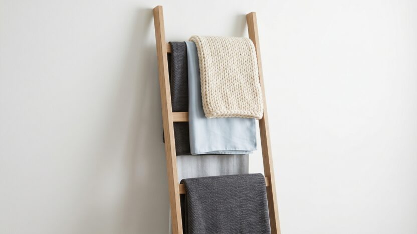
- A small storage basket or ladder shelf for off-season throw storage
- At least two to four throws total (one per season per main room)
- Seasonal color swaps can extend to cushion covers too
- Storage that keeps throws clean and accessible between seasons
- Labels or categories for easy rotation
How to Style It:
- At the start of each season, pull your throw basket and assess what you have.
- Choose throws that feel appropriate in weight and color for the coming months.
- Swap your summer lightweight throw for a heavier autumn or winter version in late September.
- Consider matching the seasonal throw to one other element — a candle, a plant, a vase — for a coordinated look.
- Store off-season throws in a breathable cotton bag to prevent musty odors.
- Use seasonal transitions as a reason to assess whether any throws need replacing.
- Keep one neutral, year-round throw that works in any season as your anchor piece.
5. Use Throws to Introduce an Accent Color
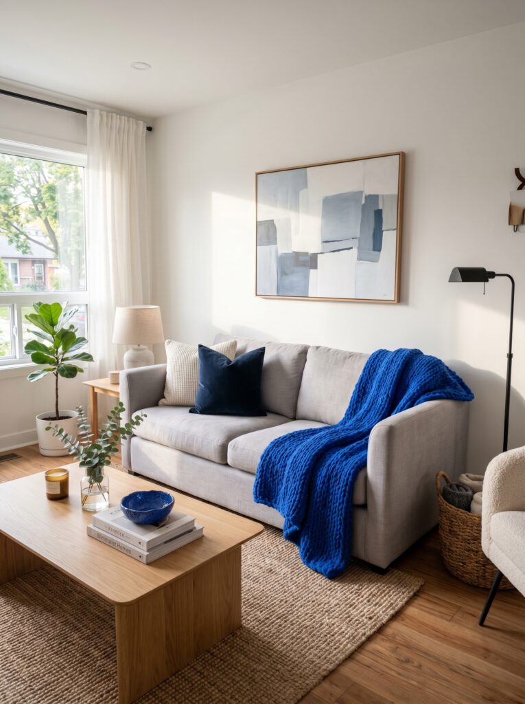
A throw is one of the lowest-commitment, highest-impact ways to test a new color in your home. If you have ever been tempted by a bold accent color but felt nervous about painting a wall or investing in new furniture, a throw is your perfect starting point. It introduces the color in a small, removable, completely reversible way.
Key Elements:
- A bold or unexpected accent color that works with your existing palette
- Color echoing — repeat the throw color in at least one or two small accessories
- A predominantly neutral base room to let the color breathe
- The 60-30-10 color rule: 60% dominant, 30% secondary, 10% accent
- Cushion, artwork, or ceramics in the same accent hue
- A throw at least 50″ wide to provide enough color presence
- High-quality, saturated color with good dye retention (cheap throws fade quickly)
How to Style It:
- Identify the accent color you want to test — look to existing artwork, plants, or ceramics for inspiration.
- Choose a throw in that accent color in a texture that suits your room’s style.
- Drape it in the room’s main focal area — the primary sofa, the main armchair, or the bed.
- Add one or two small accessories in the same accent color nearby (a vase, a book cover, a small bowl).
- Step back and live with it for a week before deciding if the color feels right long-term.
- If it works, you can then consider committing to that color in cushions or larger decor elements.
- If it does not work, simply swap the throw for a different tone — no paint, no damage, no commitment.
6. Style the Foot of Your Bed Like a Hotel
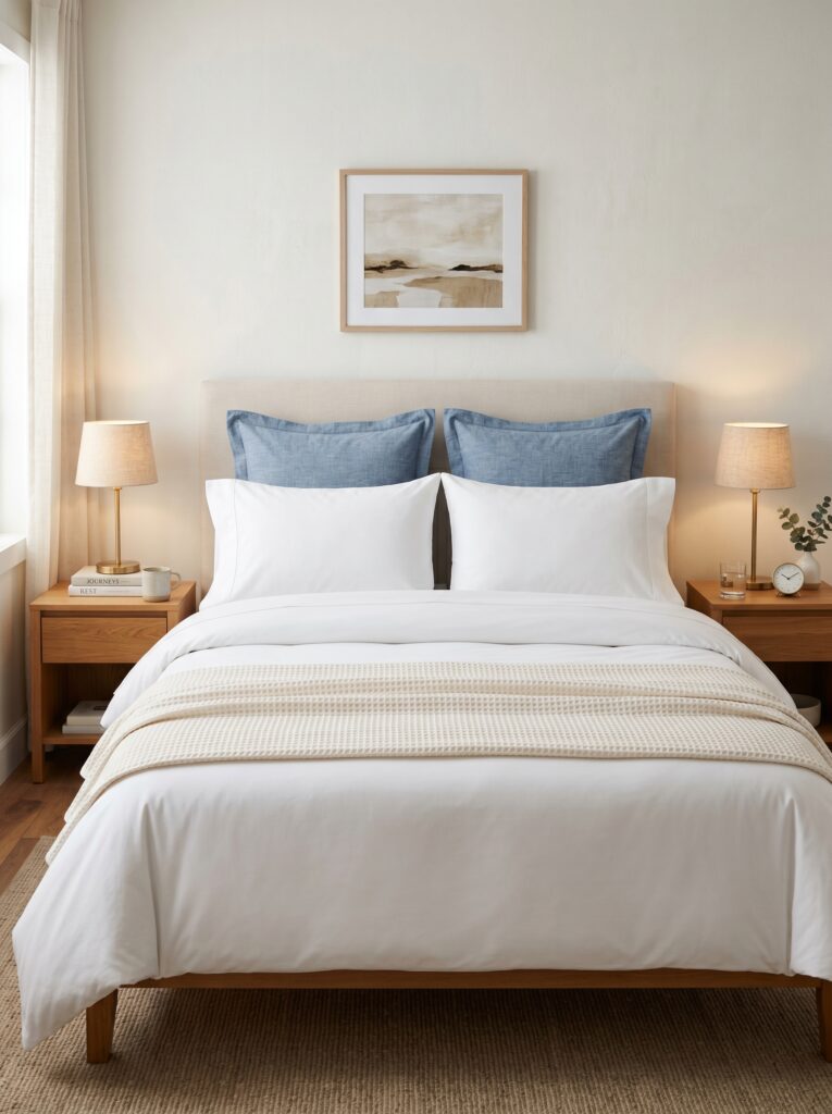
Throws are not just for sofas. One of the most elegant and underused styling moves is draping or folding a throw across the foot of a bed. This single addition transforms an ordinary bedroom into something that feels polished, intentional, and hotel-inspired. It also adds practical warmth for those nights when you want just a little extra coverage without pulling back the full duvet.
Key Elements:
- A throw that complements the bedding in texture and color but does not perfectly match
- Clean, even fold that sits straight across the foot of the bed
- Enough width to drape slightly over both sides of the mattress
- A throw that is slightly lighter in color than the main duvet for visual separation
- Thread count of at least 200 in cotton throws for a crisp, luxurious look
- Matching or coordinating cushion details
- Space between the throw and the nearest pillow arrangement for visual breathing room
How to Style It:
- Make your bed fully before adding the throw.
- Fold the throw lengthwise into thirds to create a neat, hotel-style rectangle.
- Lay it across the lower third of the bed, approximately 12–18 inches from the foot.
- Smooth it flat and make sure both ends hang evenly.
- For a softer look, unfold the throw partially and allow it to drape more casually over one corner.
- Pair with two or three decorative cushions at the headboard for a complete, layered bed styling.
- Choose a throw that can double as an actual blanket — practicality and style together is always the goal.
I’ve noticed that styling the foot of the bed is one of those small changes that makes a bedroom feel immediately more grown-up and considered. It takes about thirty seconds and changes everything.
7. Drape a Throw Over a Chair for Instant Warmth
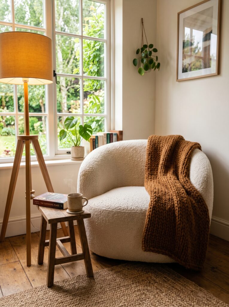
A lone armchair or accent chair can sometimes feel a little disconnected from the rest of a room’s decor. Draping a throw over the back of a chair — or folding it casually over one arm — instantly softens the silhouette, adds texture, and invites someone to sit down, pull the throw across their lap, and stay awhile.
Key Elements:
- A throw that contrasts with the chair upholstery in either texture or color
- Enough length to drape from the chair back to the seat or floor
- A chair style with clean lines that benefits from the added softness
- Warm, inviting tones that complement the surrounding decor
- A nearby side table or stool to complete the reading nook vignette
- A second textural element — a cushion or a plant — to anchor the arrangement
- Fringe or tassel details that add extra visual charm when viewed from across the room
How to Style It:
- Drape the throw over the top of the chair back, letting equal amounts hang on each side initially.
- Shift one side slightly lower than the other for a more relaxed, asymmetric feel.
- Let the lower end trail gently toward the seat or floor — do not tuck it up tightly.
- Smooth the upper portion flat against the chair back so it looks intentional rather than abandoned.
- Add a single cushion in a complementary color to the chair seat.
- Place a small side table or stack of books nearby to complete the styled vignette.
- Use this arrangement to direct the eye toward a reading corner or cozy secondary seating area.
8. Mix Patterns and Solids Thoughtfully
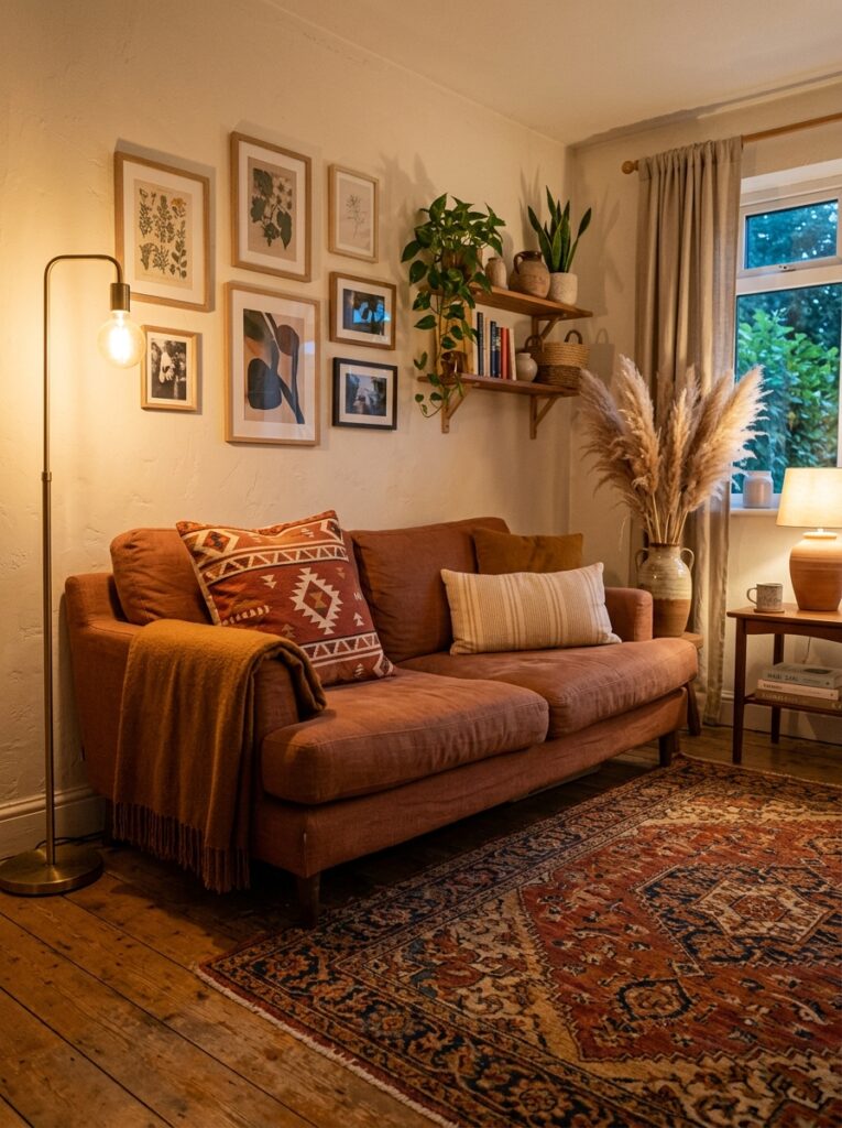
One of the most common decorating mistakes I see is using too many patterns at once — or, conversely, keeping everything so neutral that the room feels completely flat. Throws are a brilliant tool for striking the right balance. A patterned throw can add visual interest to a solid sofa, while a solid throw can calm down an already-busy arrangement.
Pattern Mixing Guide for Throws & Cushions:
| Sofa Style | Best Throw Choice | Cushion Pairing |
|---|---|---|
| Solid neutral (beige, gray, white) | Patterned or textured throw | Mix of solid + one patterned cushion |
| Patterned upholstery | Solid throw in accent color | Solid cushions only |
| Solid bold color | Solid throw in lighter tone | One patterned cushion maximum |
| Textured fabric (boucle, velvet) | Solid smooth throw | Textured cushions without pattern |
| Striped or checked upholstery | Organic or botanical patterned throw | Solid cushions in pull-out colors |
Key Elements:
- Vary the scale of patterns — small geometric with large organic, for example
- Keep patterns within the same color family for cohesion
- No more than two distinct patterns in one seating arrangement
- Use solids as anchors between patterned pieces
- Ensure the throw reads differently from the cushions nearby
How to Style It:
- Identify what pattern, if any, already exists in your cushions or upholstery.
- If your cushions are patterned, choose a solid throw that pulls one color from the pattern.
- If your sofa and cushions are all solid, a patterned or woven throw adds needed visual interest.
- Keep the scale of any throw pattern proportional to the furniture — large furniture can handle large patterns.
- Use the rule of three: aim for one large solid element, one medium textured piece, and one small patterned detail.
- Step back and view the full arrangement from the doorway, not up close.
- If anything feels visually “loud,” remove it rather than adding more pieces to compensate.
9. Use Throws to Define Zones in Open-Plan Spaces
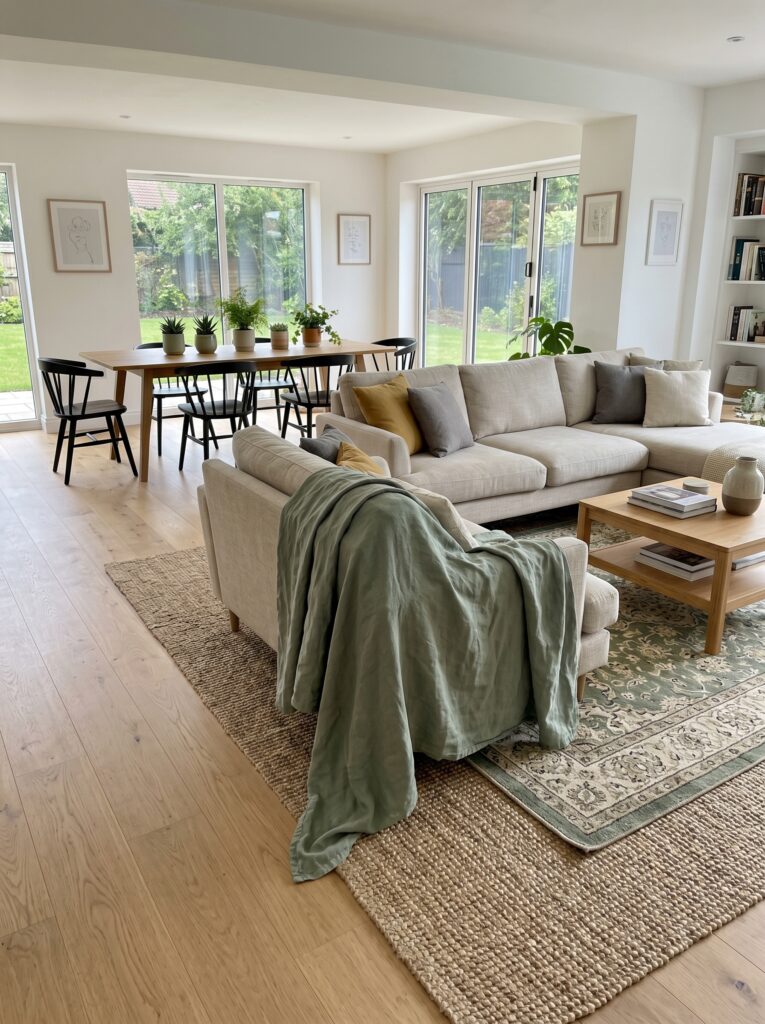
Open-plan living spaces can sometimes feel like one large undefined room without clear zones or purpose. Throws, used strategically, can help anchor and define different areas without requiring walls, rugs, or major furniture rearrangement. The color and texture of a throw placed on your sofa visually signals: this is the living area, this is the cozy zone, this is where you sit and relax.
Key Elements:
- A throw that contrasts slightly with the overall room color palette to create visual separation
- Placement on the furniture that anchors the “living zone” most clearly
- Color that is echoed — subtly — in one element of an adjacent zone
- A rug beneath the seating area to reinforce the zoning effect
- Consistent texture within the zone (matching cushion and throw textures)
- Enough color presence to read clearly from across the full open space
- A complementary but distinct color scheme for the separate zone
How to Style It:
- Identify the primary seating zone — typically where your sofa or sectional sits.
- Choose a throw in a warm, distinctive color that differentiates this zone from the open space around it.
- Drape it prominently over the main sofa or sectional — make it visible from across the room.
- Reinforce the zone boundary with a large area rug in a complementary tone.
- Echo the throw color very subtly in one element of a neighboring zone — a plant, a small bowl, a candle.
- Avoid using the same throw color or texture in both zones, as this reduces the visual separation.
- Use warm lighting within the seating zone to strengthen the feeling of it being a distinct, cozy destination.
I’ve seen this approach work beautifully in small studio apartments especially — one throw can effectively make a living room “exist” within a space that technically has no walls.
Common Throw Decorating Mistakes to Avoid
Even with great instincts, a few easy-to-make mistakes can undercut an otherwise beautiful arrangement. Here is what to watch for:
- Over-folding the throw into a perfect rectangle. This looks stiff and unused. Always introduce some natural looseness.
- Choosing a throw that is too small. A throw that barely covers a sofa arm looks sparse. Aim for 50″ x 60″ minimum for most furniture.
- Matching the throw exactly to your cushions. This flattens the arrangement. Contrast is what creates depth.
- Ignoring fiber content. Cheap acrylic throws pill, fade, and look tired quickly. Invest in natural or blended fibers when possible.
- Using more than two throws in one arrangement. Three or more throws on a single piece of furniture tends to look cluttered rather than layered.
- Forgetting to steam or shake throws before styling. A fresh-from-the-bag throw with fold creases undermines the whole look.
Frequently Asked Questions
How do I keep a throw from looking messy? The key is intentional looseness. There is a difference between a thrown-on-in-a-hurry look and a casually styled drape. Always start with a deliberate placement and then introduce gentle asymmetry — one end slightly lower, a soft fold here, a visible texture detail there. When in doubt, shake the throw out completely and re-drape rather than adjusting piece by piece.
What size throw is best for a standard sofa? For a standard three-seat sofa, a throw measuring 50″ x 60″ or 60″ x 80″ works best. Larger sofas, sectionals, or king-size beds benefit from throws closer to 60″ x 80″ or even larger. A throw that is too small looks skimpy regardless of how beautifully you style it.
Can I use throws in rooms other than the living room? Absolutely. Throws work in bedrooms (across the foot of the bed), reading nooks, home offices (over a chair), sunrooms, and even covered outdoor spaces if the material is suitable. The key is choosing the right material and scale for each space.
What is the best throw material for everyday use? Cotton and cotton-blend throws are the most practical for everyday use — they are durable, machine-washable, and work well in all seasons. Wool and cashmere blends are luxurious but require more careful laundering. Faux fur and velvet look beautiful but can be more high-maintenance.
How do I choose a throw color that goes with my existing decor? Start by identifying the two or three main colors already in your room (wall color, sofa color, rug color). Then choose a throw in either a deeper or lighter shade of one of those colors, or in a complementary accent color that does not currently appear in your space. Avoid introducing completely unrelated colors unless you are intentionally making the throw a bold accent statement.
How many throws should I have per room? For most rooms, one to two throws is plenty. The goal is to add warmth and texture, not to fill every surface. A living room with one beautifully draped throw on the sofa and a second folded in a nearby basket looks intentional. More than two throws on display in one small room tends to feel cluttered.
Final Thoughts
Throws are small, affordable, and quietly powerful. Of all the styling tools available to home decorators — furniture, paint, lighting, rugs — a throw might just offer the best return on investment. They can change the color story of a room, add the texture that makes a space feel alive, and create the softness that makes a house feel like a home.
Decorating with throws is not complicated. It just takes a little intention. Choose your texture first, drape with confidence, layer thoughtfully, and let the seasons inspire your color choices. I’ve seen how even the simplest change — one beautifully chosen throw on a bare armchair — can make an entire room exhale.
Save this guide for your next styling session, share it with someone refreshing their home, and come back to it every time a new season rolls around. Your home deserves that kind of care.

Indy Santos is a passionate interior styling specialist and home living enthusiast with a focus on contemporary decor, smart space planning, and affordable design inspiration. At Inspired Homex, she provides readers with fresh decorating concepts, actionable advice, and professional guidance to create comfortable, elegant, and well-organized homes that reflect their personal style.